Keeping Up with the Hamiltons
The Bush administration's latest proposal to cut income taxes has once again raised questions about the top-heavy distribution of income in the United States and reprised the familiar lament, "The rich get richer and the poor get poorer."
The U.S. Census Bureau has tracked income inequality at the national level since 1947 with the annual March supplement to the Current Population Survey (CPS). From 1947 through the late 1960s, income inequality declined as income became more evenly distributed among the nation's households. Around 1968, however, the trend reversed. A common way of measuring income inequality begins with ranking all households in the sample on their income in the previous year and splitting the distribution into quintiles (five equal shares, or fifths). The shares of aggregate income received by each quintile are calculated and compared. In 1968, the highest income quintile received 42.8 percent of aggregate income while the lowest fifth received 4.2 percent. By 2001, the household income shares had shifted even more toward the top of the income distribution, with 50.1 percent of aggregate income now going to the top quintile and only 3.5 percent to the lowest quintile.
Similar analysis with CPS data isn't feasible for local areas such as counties because of limited sample size. Census 2000 summary income tables also have serious limitations, presenting the number of households within predefined income ranges, thus precluding the ranking described above. While using census data to measure income inequality among households within counties is problematic, it's easier to make comparisons across counties. Instead of focusing on households, the unit of analysis is shifted to counties.
By almost any measure, Hamilton County stands head and shoulders (torso, waistline and kneecap too) above all other Indiana counties on the income yardstick. This appears to be due to the disproportionate number of households with extremely high incomes.
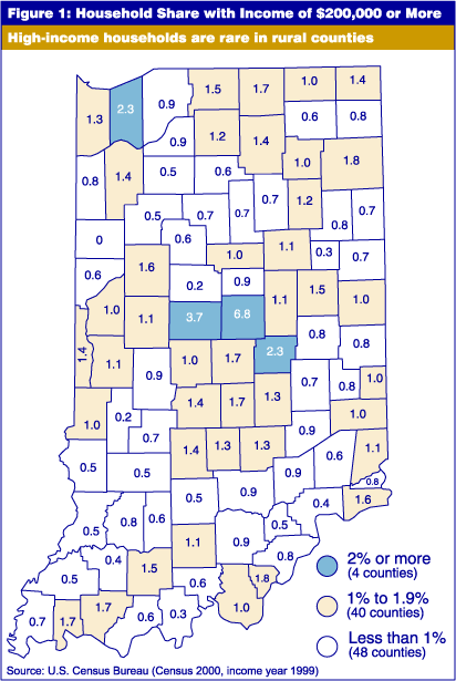
On Census 2000 summary tables, the top range for income in 1999 is $200,000 or more. Statewide, households with 1999 income at this level constituted 1.5 percent of all households. Figure 1 portrays the household share with income in 1999 of $200,000 or more. In more than half of Indiana's counties, this household share was less than 1 percent. Only four counties had at least 2 percent of their households at the highest income level, with Hamilton County leading the pack at 6.8 percent. The closest county on the household share measure was Boone, well behind at 3.7 percent. Hancock and Porter round out the list of counties in the top category. The map confirms that these high-income households are especially rare in rural counties.

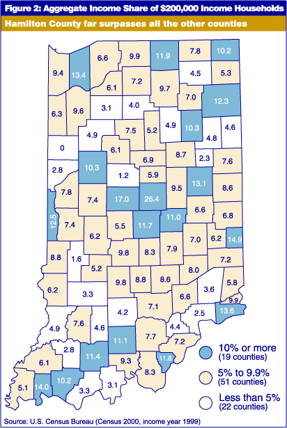
Another table on Census 2000 Summary File 3 presents data on aggregate household income and the amount that is attributable to households with income of $200,000 or more. Figure 2 depicts the share of aggregate income earned by these elite households. Once again, Hamilton easily outdistances the field with a figure of 26.4 percent, compared to second-place Boone County at 17 percent, and the state at 10.3 percent. Households in the $200,000 income range accounted for 10 percent or more of aggregate income in 19 Indiana counties. In contrast to Figure 1, a number of mostly rural counties scored in the highest category on the income share measure. Tiny Union County, with only 2,798 households, had the third highest score, with 14.9 percent of aggregate income attributable to $200,000-income households. Three other counties with fewer than 10,000 households—Switzerland, Vermillion and Orange—placed in the top category on this measure.

The gap between the household share depicted in Figure 1 and aggregate income share in Figure 2 seems, at first glance, to provide a useful measure of income inequality. Since we're talking about the upper tier of income, we know that the aggregate income share will always exceed the household share. However, the relative size of the gap gives at least some indication of the degree to which state or county income is concentrated in a few elite households.
The gap was zero for one county, Benton, where there were no households with income exceeding $200,000, resulting in perfectly matched zero shares on households and aggregate income. The only other set of circumstances that could result in a zero gap would be the utopia in which all households in the county had income of at least $200,000.
Statewide, the gap between household share and aggregate income share was 8.8 percentage points. Sixteen of 92 counties posted larger gaps, with Hamilton County again ranking first, with a spread of 19.6 points, followed by Union County at 13.9 points. Rounding out the top five counties on this measure were Boone, Vanderburgh and Switzerland. A large gap indicates that a substantial number of households in the top income tier had income in 1999 far exceeding $200,000.
Average Household Income
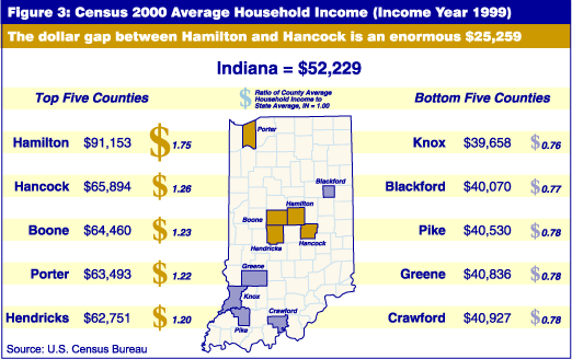
It would be hard to overstate how much Hamilton County stands apart from the remainder of Indiana on Census 2000 income measures. Another revealing yardstick for comparing counties is average household income. Median income is generally regarded as a superior summary measure, since it is less influenced by extreme values at the top of the income distribution, but the average is useful here precisely because the impact of elite, high-income households is the question of interest. In 1999, Hamilton County's average household income was $91,153, compared to $65,894 for second-place Hancock County, and $52,229 for the state. The dollar difference between first and second place is $25,259, an enormous gap equivalent to the $25,364 difference between second-place Hancock and 90th-ranked Pike County. The ratio of Hamilton County's average household income to Hancock is 1.38, meaning that the average Hamilton County household had income in 1999 that was 38 percent higher than the typical Hancock County household, which itself had 26 percent greater income than the average household statewide.

Census 2000 data examined in this study may be inadequate to give a complete picture of income inequality within counties but provide a sharper image of inequality across counties. If this were the Indy 500, Hamilton County would have lapped the field a few times, and its lead over other Hoosier counties might be measured in minutes rather than seconds.
John Besl
Research Demographer, Indiana Business Research Center,
Kelley School of Business, Indiana University
