The growing divide in life expectancy among Indiana counties

The divide between the state’s higher life expectancy counties and those on the lower end continues to widen.
In 1984, the life expectancy at birth for residents of Hamilton County was 1.1 years longer than for those living in Scott County. As of 2018, the gap between these two has grown to nearly nine years.
To be sure, these communities are outliers on either end of the spectrum. Hamilton County’s life expectancy of 81.8 in 2018 is roughly two years greater than runner-up Monroe County (79.9), while Scott County’s mark of 72.9 is more than a year below Wayne County, holder of Indiana’s second-lowest life expectancy at 74.3.1
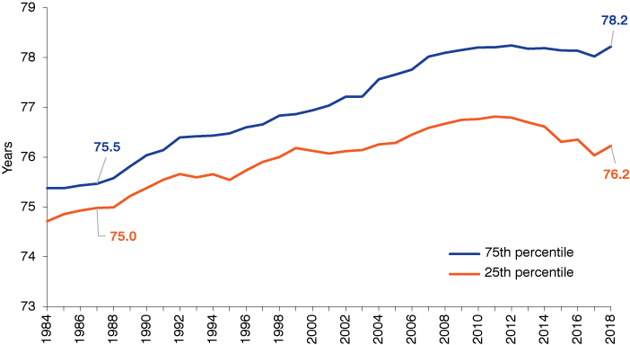
Even beyond these extremes, the divide between the state’s higher life expectancy counties and those on the lower end continues to widen. In 1987, the difference between the Indiana county at the 75th percentile in this measure and that at the 25th percentile was 0.5 years. This gap has increased fourfold in the meantime and now sits at a full two years (see Figure 1).
Figure 1: Life expectancy for Indiana counties at the 75th percentile and 25th percentile, three-year moving average
Source: United States Mortality Database. University of California, Berkeley (USA). Available at usa.mortality.org (data downloaded on 1/15/2022)
Unfortunately, these shifts are not the product of all counties simply rising at different rates, but rather are driven by a widespread decline in life expectancy in recent years. In fact, life expectancy for Indiana as a whole peaked in 2012 and had declined 0.5 years by 2018. (Keep in mind that the data presented in this article pre-date the COVID-19 pandemic.)2 More than two-thirds of Indiana’s counties also had their peak life expectancy year in 2012 or earlier, and only eight counties set a new high in this measure in 2018.3
Figure 2 shows each county’s change from its respective peak life expectancy year and its 2018 number. Wayne County has the state’s sharpest drop in this measure, declining nearly three years from a peak of 77.1 in 2012 to 74.3 in 2018. Howard County has the next-largest slide, declining more than 2.2 years since its peak in 2011. In all, 36 counties have seen a decline in life expectancy of at least one year.
Figure 2: Difference between peak life expectancy year and 2018 life expectancy by county
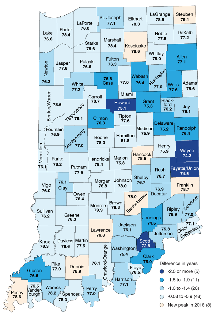
Note: Labels show life expectancy at birth.
Source: United States Mortality Database. University of California, Berkeley (USA). Available at usa.mortality.org (data downloaded on 1/15/2022)
The primary driver of declining life expectancy is the staggering rise in substance abuse–related mortality among working-age Hoosiers over the past two decades.4 One way to demonstrate the impact that this crisis is having on life expectancy is to show the degree to which different age groups contribute to the overall change in this measure.
As stated earlier, Indiana’s life expectancy dropped 0.5 years between 2012 and 2018. As Figure 3 illustrates, this decline is occurring even though Indiana residents ages 65 and older managed to make a small but positive contribution to the state’s change in life expectancy over this period (0.1 years). However, rising mortality for Hoosiers in the 20-to-44 age group and in the 45-to-64 group have combined to drag the state’s life expectancy measure down by approximately 0.6 years in the same span.
Focusing on the 20-to-44 age group, no Indiana county has been able to avoid the negative impacts of rising mortality among younger adults. Wayne County has been hardest hit, with this group alone causing a decline of 1.1 years in the county’s life expectancy between 2012 and 2018. Franklin County fared best over this period, but this age group still acted as a drag (-0.03 years) on the county’s change in life expectancy. Additionally, the 45-to-64 age group had a negative impact on this measure in a full three-quarters of the state’s counties in this span.
Figure 3: Age group contributions to total change in life expectancy, 2012 to 2018
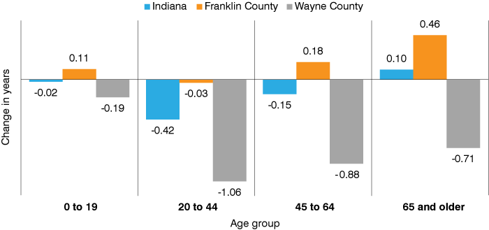
Note: Change is calculated using the 2010-2012 average and the 2016-2018 average. The age group decomposition of changes in life expectancy was done using methods developed by Eduardo E. Arriaga.5
Source: Indiana Business Research Center, using data from the United States Mortality Database. University of California, Berkeley (USA). Available at usa.mortality.org (data downloaded on 1/15/2022)
Use the following interactive data visualization to learn more about life expectancy trends in Indiana counties.
Figure 4: Life expectancy by Indiana county
Life expectancy at age 65
While the sharp rise in mortality among working-age adults is certainly the dominant driver of the decline in life expectancy, the trends for Hoosier seniors are also a growing cause for concern and are contributing to the divide among Indiana counties.
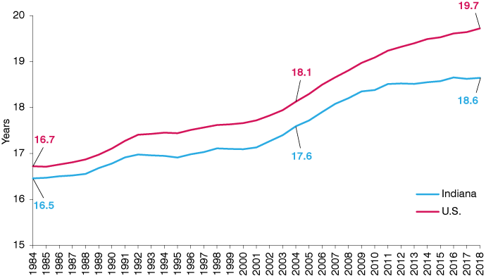
As Figure 5 shows, Indiana’s life expectancy at age 65 (i.e., the average number of years that a person who reaches age 65 can expect to live) has essentially been flat over the last decade and sits at 18.6 years in 2018. The growth rate for this measure has also slowed for the U.S. in recent years, but not to the extent seen here. As a result, the gap between the U.S. and Indiana in life expectancy at age 65 more than doubled between 2004 and 2018. Recent research points to differing rates of improvement in mortality from circulatory diseases (i.e., heart disease), smoking-related deaths and diabetes as the key drivers of regional differences in changes to this measure.6
Figure 5: Life expectancy at age 65, three-year moving average
Source: United States Mortality Database. University of California, Berkeley (USA). Available at usa.mortality.org (data downloaded on 1/15/2022)
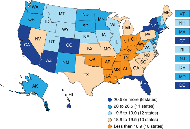
Indiana’s 2018 mark for this indicator ranks 43rd nationally and places it in a clearly defined geographic region of lower life expectancy states (see Figure 6).
Figure 6: Life expectancy at age 65 by state, 2018
Source: United States Mortality Database. University of California, Berkeley (USA). Available at usa.mortality.org (data downloaded on 1/15/2022)
While Indiana’s life expectancy at 65 trend is at least holding steady, the same cannot be said for many of its counties. In all, 54 of the state’s 92 counties have seen a decline in this measure of at least 0.2 years, with 14 of these counties seeing drops of at least 0.5 years.
Use the following data visualization to explore life expectancy at age 65 trends for all Indiana counties.
Figure 7: Life expectancy at 65 by Indiana county
Notes
- To minimize the impact of any outliers that might occur in one year, all county-level life expectancy numbers in this article refer to a three-year average (i.e., life expectancy numbers for 2018 are really a 2016-2018 average).
- The pandemic was largely responsible for a 1.8 year decline in life expectancy in the U.S. in 2020. See Sherry L. Murphy et al., “Mortality in the United States, 2020,” NCHS Data Brief, no. 427 (December 2021), https://www.cdc.gov/nchs/data/databriefs/db427.pdf
- The researchers at the University of California, Berkeley who created and maintain the tremendous United States Mortality Database have a minimum population threshold of 10,000 residents for its county life tables. Any counties that are below this level are combined with a neighbor that has similar demographic characteristics. Indiana has four counties that fall below this threshold, resulting in the following groupings: Benton/Warren counties, Crawford/Orange counties, Fayette/Union counties and Ohio/Switzerland counties. Any county tallies in this article that include these groupings treat these as two counties.
- Matt Kinghorn, “Indiana’s life expectancy falling further behind U.S.,” Indiana Business Review, Summer 2021, https://www.ibrc.indiana.edu/ibr/2021/summer/article1.html
- Eduardo E. Arriaga, “Measuring and explaining the change in life expectancies,” Demography 21, no. 1 (February 1984): 83-96.
- Yana C. Vierboom and Samuel H. Preston, “Life beyond 65: Changing spatial patterns of survival at older ages in the United States, 2000-2016,” The Journals of Gerontology 75, no. 5 (April 16, 2020): 1093-1103.
