Short haul or long haul: Migration flows to and from Indiana

Indiana experienced a net out-migration of about 5,000 households.
Moving is a fact of life, and migration is a key component when it comes to measuring population change. Most moves are fairly local in nature, but many others cross state lines.
The Internal Revenue Service (IRS) is one source of migration data—though it does not cover the full U.S. population because it is limited to those that file a federal tax return. Looking at the most recent IRS migration data (for calendar years 2013 to 2014), we see the following:
- Almost 92,200 households moved from one Indiana location to another.
- Nearly 60,400 Hoosier households moved out of state.
- 55,600 households moved into Indiana from another state
- More than 800 Indiana households moved outside the country, while Indiana gained 600 households from other nations.
Overall, Indiana experienced a net out-migration of about 5,000 households, even though 21 states had net in-migration into Indiana (see Figure 1).
Figure 1: Net migration into Indiana
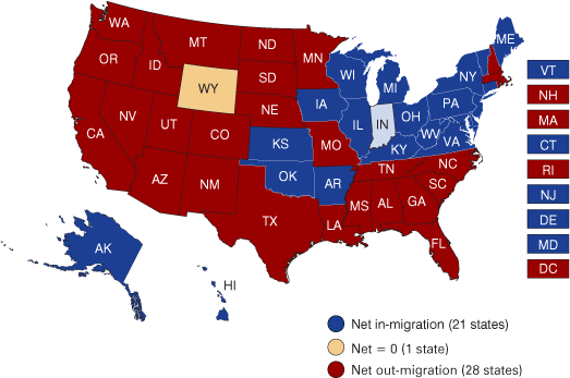
Source: IBRC, using 2013-2014 migration data from the Internal Revenue Service
Net in-migration
Table 1: Net migration into Indiana: Top 10 states
| State | Households |
|---|---|
| Illinois | 2,666 |
| Michigan | 290 |
| Kentucky | 221 |
| New York | 197 |
| Pennsylvania | 74 |
| New Jersey | 65 |
| Ohio | 58 |
| Arkansas | 50 |
| Oklahoma | 47 |
| Wisconsin | 45 |
Source: IBRC, using 2013-2014 migration data from the Internal Revenue Service
Since Illinois is the largest net importer of Hoosier households by far among the 50 states, it is worth taking a closer look at the migration flows between the two states. During this time frame, 10,812 Illinois households moved into Indiana, while 8,146 Hoosier households moved into Illinois. Figure 2 uses the available county-level data to illustrate where in each state these movers went.
Figure 2: Migration flows between Indiana and Illinois
Destination of Indiana households that moved to Illinois
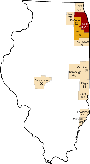
Destination of Illinois households that moved to Indiana
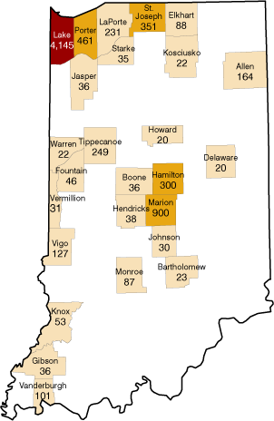
Note: Data are not disclosed for county-to-county flows with less than 20 households. The Illinois map represents 5,374 (66 percent) of the 8,146 Indiana households that moved there, while the Indiana map shows 7,652 (71 percent) of the 10,812 Illinois households that moved into the state.
Source: IBRC, using 2013-2014 migration data from the Internal Revenue Service
Not all of the county-level data are disclosed (there is a 20-household threshold), but it is obvious that the Chicago metro area (centered around Cook County) was the primary draw into Illinois for Indiana residents. Overall, 13 Illinois counties—largely along the border—met the disclosure requirements.
Meanwhile, 26 Indiana counties were reported to be the new homes to former Illinois residents. Lake County was the primary recipient of the households that moved from Illinois, though a significant number also moved into the Indianapolis region.
Net out-migration
The top five states drawing away households from Indiana (again, on a net basis) included Florida, Texas, Colorado, California and Tennessee (see Table 2).
Table 2: Indiana’s net out-migration: Top 10 states
| State | Households |
|---|---|
| Florida | -2,354 |
| Texas | -1,814 |
| California | -583 |
| Colorado | -583 |
| Tennessee | -448 |
| Georgia | -444 |
| Arizona | -429 |
| South Carolina | -323 |
| Washington | -315 |
| Oregon | -230 |
Note: Net migration between Indiana and foreign countries totaled -239.
Source: IBRC, using 2013-2014 migration data from the Internal Revenue Service
Exploring Indiana’s migration connection with Florida since it tops the list of net out-migration, we see that 4,354 Floridian households moved into Indiana, while 6,708 Hoosier households moved to the Sunshine State.
Unfortunately, only a small percentage of the household moves between these two states are disclosed at the county-level, so we cannot draw many inferences from those data.1 Looking at the limited data that are available, Marion and Hamilton counties in the Indianapolis metro top the list in terms of new homes for former Floridians. Meanwhile, the Cape Coral and St. Petersburg regions (Lee and Pinellas counties, respectively) in Florida appear to be two of the hot spots for former Indiana residents (see Figure 3).
Figure 3: Destination of Indiana households that moved to Florida
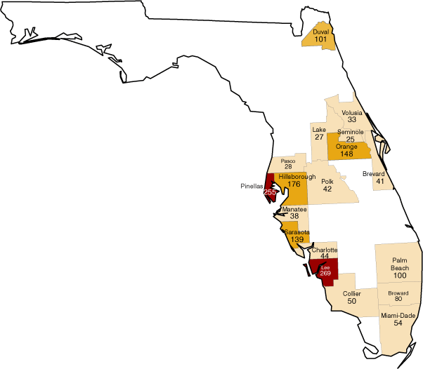
Note: Data are not disclosed for county-to-county flows with less than 20 households. The map only represents 1,650 (25 percent) of the 6,708 Indiana households that moved there,
Source: IBRC, using 2013-2014 migration data from the Internal Revenue Service
Learn more
The mostly state-level data discussed here is just the tip of the iceberg. To explore migration into other states or individual county-level migration flows in-depth, visit the IRS section on the STATS Indiana migration page to download the full Indiana spreadsheet.
Notes
- Data are not disclosed for county-to-county flows with less than 20 households. The Florida county-level data represent 1,650 (25 percent) of the 6,708 Indiana households that moved there, while the Indiana county-level data represent only 658 (15 percent) of the 4,354 Floridian households that moved into the state.