Recession Alters Indiana Migration Trends
One important side effect of the recent recession has been a slowdown in migration across much of the country. Once booming states like Florida, Arizona and Nevada saw comparatively small population gains through migration in 2009. Indiana recorded a 2009 net in-migration of just 2,390 residents—our second lowest tally in this decade.
These waning migration trends have not occurred uniformly within Indiana, however. Using recently released data from the U.S. Census Bureau, this article will examine the 2009 migration figures for Indiana counties and compare them to trends throughout the decade. We will also pay particular attention to the interesting dynamics in the Indianapolis metro area and compare it to other major Midwestern cities.
2009 Migration
Figure 1 shows that Hamilton County led all Indiana counties with a net influx of more than 5,000 residents through migration followed by Hendricks (1,840), Tippecanoe (1,450) and Clark (1,190) counties. Marion County’s net migration figure of 1,030 people marks its first net inflow since 1993.
The tough employment situation in Elkhart County resulted in the state’s largest net out-migration of 1,580 residents. Other areas with significant net out-migrations were Lake and St. Joseph counties (-1,560 each) and Howard County (-850).
Figure 1: Net Migration by County, 2009
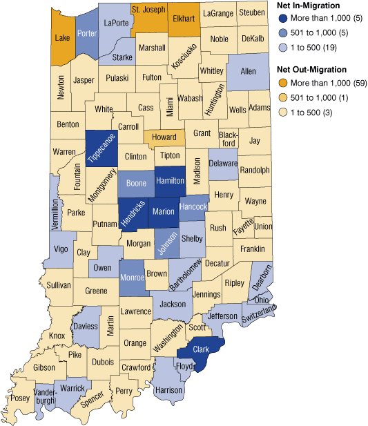
Source: IBRC, using U.S. Census Bureau data
Figure 2 illustrates the percent of population change in each county that was due to net migration. Central Indiana suburban counties again lead the way on this measure but we see that it is largely rural counties that lost the greatest proportion of their populations through migration. Pike County in southwestern Indiana lost more than 2 percent of its population through net migration in 2009. A net outflow of residents accounted for more than a 1.5 percent population decline in White, Parke and Crawford counties
Figure 2: Percent Change in Population Due to Net Migration, 2009
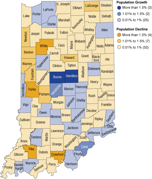
Source: IBRC, using U.S. Census Bureau data
In looking at these data it is important to keep in mind that we are considering migration only and not overall population change. For example, Elkhart and Lake counties had the greatest net out-migration figures in 2009, yet both of these counties registered overall population growth because their natural increase (more births than deaths) more than compensated for their net out-migration.
Shifting Trends in Many Parts of Indiana
At first glance, there is nothing too surprising in the maps above. Twenty-nine counties registered a net in-migration in 2009—the same number of Indiana counties that had a net in-migration from 2001 to 2008. Suburban counties in the Indianapolis metro area remained the top magnets for movers while many rural areas of the state continue to lose residents through migration.
What is noteworthy about Indiana’s migration trends in 2009, however, is the apparent slowdown of movement in many parts of the state. Migration is a volatile process that is driven largely by economic and housing considerations. People most commonly make long distance moves to improve their employment situation while intra-regional moves (e.g. Marion County to Hamilton County) are typically spurred by housing decisions. The depressed labor market throughout much of the country would certainly discourage long distance moves. Meanwhile factors including tightened access to credit, the slumping housing market and employment insecurity would likely prompt many potential intra-regional movers to postpone a home purchase.
To help demonstrate this development, we organize all Indiana counties into one of four categories based on their migration trends throughout the decade (see Figure 3). The first category features the few counties whose 2009 net in-migration exceeded their positive average annual net migration between 2001 and 2008. For example, Boone County’s net migration of 1,000 residents in 2009 was an improvement over its already strong average annual tally of 850 residents earlier in the decade. The other counties with accelerated in-migration were the university communities of Tippecanoe and Monroe counties, Clark and Floyd counties in the Louisville metro area and Bartholomew County.
Figure 3: Comparisons—Average Annual Net 2001 to 2008 Compared to 2009
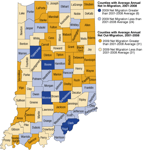
Source: IBRC, using U.S. Census Bureau data
The second group comprises counties whose 2009 net migration was less than their positive average annual mark throughout the decade. This group includes several counties in the Indianapolis metro area including Hamilton, Hendricks, Johnson, Hancock, and Morgan counties. Twelve of the 24 counties in this group fell from their general in-migration trend to a net outflow in 2009 including Elkhart, Putnam, Morgan and Dubois counties.
The remaining groups include the 62 counties that averaged an annual net out-migration between 2001 and 2008. Half of these communities saw either a lower level of net out-migration or registered a net influx of residents. The other 31 counties saw a greater than average net out-migration in 2009.
Table 1 shows some of the more extreme examples of these shifting trends. The most notable shift has occurred within the Indianapolis metro area where Marion County’s net migration mark for 2009 surpassed its average for the decade by more than 5,000 residents. Meanwhile, six of the 10 counties with the largest negative differences were counties in the Indianapolis metro area.
Table 1: Biggest Differences between Average Annual Net Migration from 2001 to 2008 and 2009 Net Migration
| County | Average Annual Net Migration, 2001 to 2008 | 2009 Net Migration | Difference |
|---|---|---|---|
| Marion | -4,001 | 1,030 | 5,031 |
| Delaware | -546 | 165 | 711 |
| Tippecanoe | 1,039 | 1,451 | 412 |
| Grant | -537 | -156 | 381 |
| Madison | -345 | -11 | 334 |
| Allen | -153 | 133 | 286 |
| Monroe | 614 | 899 | 285 |
| Clark | 959 | 1,187 | 229 |
| Wayne | -456 | -244 | 212 |
| LaPorte | -166 | 24 | 190 |
| Hamilton | 7,447 | 5,175 | -2,272 |
| Elkhart | 317 | -1,576 | -1,893 |
| Hendricks | 3,271 | 1,838 | -1,433 |
| Johnson | 2,110 | 954 | -1,156 |
| Lake | -706 | -1,559 | -853 |
| Porter | 1,335 | 532 | -803 |
| Morgan | 243 | -398 | -641 |
| St. Joseph | -993 | -1,559 | -566 |
| Hancock | 1,120 | 598 | -522 |
| Putnam | 61 | -426 | -487 |
Source: IBRC, using U.S. Census Bureau data
Other areas with substantial migration improvements in 2009 include Delaware, Madison and Grant counties along the Interstate 65 corridor. These counties have seen several years of employment declines (particularly in manufacturing) and have had the prevailing net out-migration trend to match. These counties have lost employment through the recession as well, but their rate of job loss has been less severe than the state average.1 Perhaps the lack of employment opportunities elsewhere has removed a key incentive for some residents in these communities to move.
Elkhart, Lake and St. Joseph counties had a comparatively large net outflow of residents in 2009 but it is interesting to note that these counties saw a similar out-migration during the last economic downturn. Between 2001 and 2003 (a period that coincides with our last recession), each of these counties had at least one year of net out-migration that approached or was greater than their 2009 mark.
Focus on Large Metropolitan Areas
As we have seen, some of the most dramatic migration shifts in 2009 were seen in the Indianapolis Metropolitan Statistical Area (MSA).2 Figure 4 provides greater detail on this region’s net migration trends and suggests that there has been some degree of interdependence between Marion County and surrounding areas. Most notably, the suburban county in-migration declined when fewer people were moving from Marion County. This relationship makes sense given that the most recent migration data (2007) from the Internal Revenue Service indicated that 37 percent of migrants to these suburban counties moved there from Marion County.
Figure 4: Net Migration in the Indianapolis Metro Statistical Area (MSA), 2001 to 2009
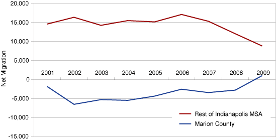
Source: IBRC, using U.S. Census Bureau data
This trend is not unique to the Indianapolis MSA. As Figure 5 shows, many Midwestern cities have had consistent net out-migration in this decade; yet with the exception of Detroit, each also had a substantial improvement in their net migration figure in 2009.3 Columbus, Ohio; Minneapolis-St. Paul; and Louisville joined Indianapolis in posting a net in-migration for 2009. With the exception of Cleveland and Milwaukee (which have had little suburban growth in this decade), these regions have also seen a corresponding decline in suburban migration.
Figure 5: Percent Change in Population due to Net Migration, 2001 to 2008 and 2009*
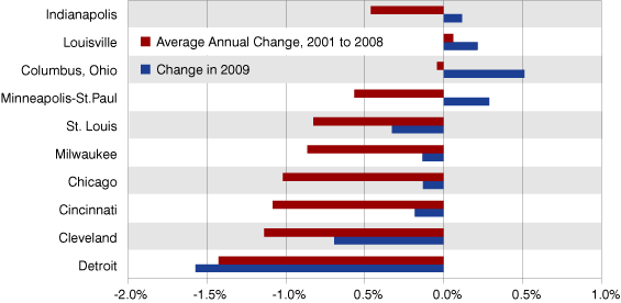
*These are county level data. However, the counties are referred to by the more familiar city names in this graphic.
Note: Minneapolis-St.Paul includes Hennepin and Ramsey counties. St. Louis combines St. Louis County and St. Louis city.
Source: IBRC, using U.S. Census Bureau data
Conclusion
The recession has certainly had an effect on migration patterns in Indiana as it has throughout much of the country. The most intriguing development in the Midwest may be the shifting trends in the Indianapolis metro area and many of its regional peers.
The point in examining these major metro areas is not to suggest that more people have suddenly opted for urban living over suburbia. Rather, the more plausible explanation for this about-face is that the number of residents moving away from these cities during the tough economy has declined much more than the number of residents moving in. Unfortunately, given that there is only a “net” migration number to analyze, the data are not detailed enough to say with certainty that this is the case.
It is too early to know whether this recession marks a true turning point in urban/suburban migration patterns but it seems likely that once the economy gets moving again, people will get moving too.
Notes
- Employment change was measured from second quarter 2008 to second quarter 2009 using the Bureau of Labor Statistics’ Quarterly Census of Employment and Wages.
- The Indianapolis MSA includes Boone, Brown, Hamilton, Hancock, Hendricks, Johnson, Marion, Morgan, Putnam and Shelby counties.
- These are county level data. However, the counties are referred to by the more familiar city names.
Matt Kinghorn
State Demographer, Indiana Business Research Center, Indiana University's Kelley School of Business