Commuting Brings Money In or Takes Money Out
Adjustment for residence: it's one tiny line in the personal income calculation that converts earnings by place of work to data by place of residence.1 However, these data are also valuable when it comes to answering other questions, such as the impact of local commuting on county income. In this article, we will focus on Indiana counties and explore the 2007 data from the Bureau of Economic Analysis;2 but first, some definitions are in order:
- Gross earnings inflow: the money earned by residents who work outside of the county.
- Gross earnings outflow: the money earned at jobs within the county by people living outside the county
- Net Residence Adjustment: the gross earnings inflow minus gross earnings outflow. A positive net residential adjustment indicates that those residents who live in the county but work elsewhere earn more (as a group) than those people who commute into the county for work.
Gross Earnings Inflow
Table 1 shows the largest inflows occurred in Hamilton and Lake counties, thanks to the large number of residents working in Indianapolis and Chicago, respectively.
Table 1: Largest Gross Earnings Inflows in 2007
| Rank | County | Inflow (in thousands) |
| 1 | Hamilton | $5,041,685 |
| 2 | Lake | $3,509,708 |
| 3 | Marion | $2,782,179 |
| 4 | Porter | $2,490,938 |
| 5 | Hendricks | $2,161,222 |
| 6 | Johnson | $2,095,408 |
| 7 | Morgan | $1,275,193 |
| 8 | Clark | $1,238,334 |
| 9 | Hancock | $1,224,427 |
| 10 | Floyd | $1,179,451 |
Source: IBRC, using data from the Bureau of Economic Analysis
If we look at inflow as a percent of earnings by place of residence, a different picture emerges, with only Morgan County appearing among the top 10 in both Table 1 and Table 2. Here we see just how much many smaller counties benefit from their proximity to jobs in a larger metropolitan region. For example, each county in Table 2 is part of a defined metropolitan statistical area, with the exception of Union and Switzerland counties (which are adjacent to the Cincinnati-Middletown metro).
Table 2: Inflow as a Percent of Earnings by Place of Residence, 2007
| Rank | County | Inflow | Percent |
| 1 | Franklin | 349,469 | 71.5 |
| 2 | Morgan | 1,275,193 | 70.5 |
| 3 | Ohio | 88,850 | 67.8 |
| 4 | Brown | 242,768 | 66.7 |
| 5 | Union | 109,499 | 65.8 |
| 6 | Warrick | 1,007,459 | 64.0 |
| 7 | Tipton | 255,899 | 61.7 |
| 8 | Newton | 187,666 | 60.9 |
| 9 | Switzerland | 120,806 | 60.1 |
| 10 | Harrison | 511,517 | 59.5 |
Note: Earnings by place of residence were adjusted for contributions to government social insurance (see Endnote 3).
Source:
IBRC, using data from the Bureau of Economic Analysis
Gross Earnings Outflow
Marion County had the largest outflows at nearly $13.6 billion. This is partially due to the sheer size of the Indianapolis economy. Lake County came in second on this measure at $2.4 billion.
When looking at percentages, Martin County is seen as an outlier, with 70 percent of its earnings by place of work leaving the county. This is not surprising given that Martin County's largest employer, the Crane Naval Base, employs large numbers of workers from surrounding counties. The next highest outflow rate is 46 percent in Gibson County, home to Princeton's Toyota manufacturing plant. Figure 1 shows the outflow percentages for all 92 counties. Large outflows indicate that changes in the county's employment environment will likely have bigger ripple effects in the broader region than might otherwise be the case.
Figure 1: Outflow as a Percent of Earnings by Place of Work, 2007
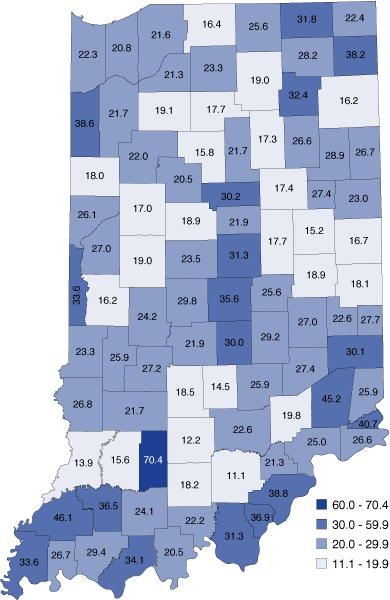
Source: IBRC, using data from the Bureau of Economic Analysis
Considering the "Net"
When considering inflows and outflows together, Hamilton and Porter counties had the most to gain from commuting, with positive net flows reaching nearly $2.8 billion and $1.8 billion, respectively. However, as a percent of earnings by place of residence, Morgan, Brown and Franklin counties all hovered near the 60 percent mark, as shown in Table 3, meaning that approximately 60 percent of all the money earned by their residents came from outside the counties themselves.
Table 3: Counties with Highest Net Flow as a Percent of Earnings by Place of Residence, 2007
| Rank | County | Net Flow (in thousands) | Percent |
| 1 | Morgan | $1,125,186 | 62.2 |
| 2 | Brown | $222,287 | 61.1 |
| 3 | Franklin | $289,621 | 59.3 |
| 4 | Union | $87,679 | 52.7 |
| 5 | Tipton | $211,564 | 51.0 |
| 6 | Warrick | $771,688 | 49.0 |
| 7 | Washington | $272,008 | 48.1 |
| 8 | Crawford | $87,129 | 47.9 |
| 9 | Starke | $168,267 | 46.0 |
| 10 | Parke | $134,107 | 45.7 |
Note: Earnings by place of residence were adjusted for contributions to government social insurance (see Endnote 3).
Source:
IBRC, using data from the Bureau of Economic Analysis
Figure 2 shows the distribution for all 92 counties.
Figure 2: Net Flow as a Percent of Earnings by Place of Residence, 2007
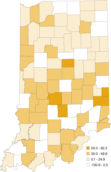
Note: Earnings by place of residence were adjusted for contributions to government social insurance (see Endnote 3).
Source:
IBRC, using data from the Bureau of Economic Analysis
Twenty counties had negative net flows, indicating that more money flows out to other places than is brought back to the county by residents working elsewhere (see Figure 3). Of all the money earned from jobs within the county, Martin, Marion, Howard and Gibson counties each had more than 20 percent flow out to other places (after factoring in the money flowing in by residents working elsewhere).
Figure 3: Net Flow of Earnings Leaving the County as a Percent of Earnings by Place of Work, 2007
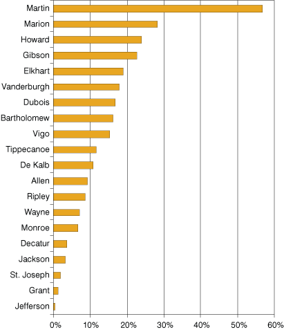
Source: IBRC, using data from the Bureau of Economic Analysis
Conclusion
About 772,000 Hoosiers commute outside of their county of residence for work.4 The implications of this activity go far beyond traffic patterns or the amount of time people spend getting to work. These data on the flow of commuter earnings help us parse out some of the economic impacts of this activity. Furthermore, as the recession continues, it is likely people will need to find work further from home, resulting in earning flow changes in many counties, making this an indicator worth revisiting.
Notes
- Personal income is calculated as Earnings by place of work minus Contributions for government social insurance plus Adjustment for residence; Dividends, interest and rent; and Personal current transfer receipts. The adjustment for residence data are inferred through journey-to-work data available from the decennial census, though several additional data sources are used to produce the annual intercensal estimates.
- These county-level data are found in Table CA91 (Gross Commuters' Earnings Flows) at www.bea.gov/regional/reis/.
- As part of the broader calculation of personal income, earnings by place of residence is calculated as earnings by place of work minus contributions for government social insurance plus gross earnings inflow minus gross earnings outflow. However, when calculating inflow as a percent of earnings, excluding the government social insurance contributions from the denominator alone artificially increases the resulting percent by a small margin. Therefore, for the purposes of this article, the earnings by place of residence have been adjusted to include the contributions for government social insurance for a more accurate calculation of the percentages.
- This is according to the annual commuting trends based on IT-40 tax returns for 2007. The number of Indiana tax filers who worked outside their county of residence increased 3.7 percent between 2005 and 2007, similar to the increase in those who live and work in the same county (3.6 percent). More data are available at www.stats.indiana.edu/topic/commuting.asp.
Rachel Justis
Geodemographic Analyst, Indiana Business Research Center, Indiana University's Kelley School of Business