Earnings per Job Growing Better than Number of Jobs
Economic development is said to be all about gaining jobs and increasing earnings per job.
The U.S. Bureau of Economic Analysis (BEA) recently released county-level earnings and employment data for 2005. These are the most comprehensive and detailed reports for the more than 3,000 counties in the nation. They help us understand how county economies are performing and the dynamics of change.
Some might object that these data are “old,” but 2005 has to end before we can have data for the full year. Then BEA gathers 2005 information from many sources. For example, 2005 IRS data are not ready until tax returns are filed in April 2006. Further, it takes time to assemble this massive database, verify its accuracy and check its internal consistency before releasing the numbers.
Job Growth
Between 2000 and 2005, Indiana had a net increase of 7,300 jobs. That's not as bad as it sounds because during the recession years, 2000 to 2003, we lost 94,700 jobs. From 2003 to 2005, we recovered that number of jobs and then some.
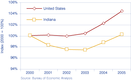
However positive that may appear, the number of jobs in the United States grew by 4.6 percent between 2000 and 2005 while Indiana advanced by a mere 0.2 percent (47th among the 50 states). Indiana added jobs at a slower rate than the nation in good times and bad, every year from 2000 to 2005 (see Figure 1).
Figure 1: Jobs in Indiana and the United States, 2000 to 2005
Wage Growth
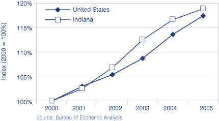
Without adjustment for inflation, average earnings per job in Indiana grew faster between 2000 and 2005 than in the United States. We advanced by 19 percent (26th in the nation) while the country moved ahead by 17.5 percent. This was, however, the result of a Hoosier spurt during 2003, after which the nation has been gaining ground on us (see Figure 2).
Figure 2: Average Earnings per Job in Indiana and the United States, 2000 to 2005
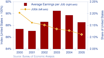
If Indiana's share of all U.S. jobs is declining (see Figure 3), how could our average wages be higher relative to the nation in 2005 than in 2000?
Figure 3: Indiana Jobs and Average Earnings Compared to the United States, 2000 to 2005
If jobs here are not growing as fast as elsewhere, there'd be more competition among workers and less among employers, keeping our earnings from growing rapidly.
Several possible ideas come to mind:
- What if we are shedding low paying jobs and developing higher paying jobs than elsewhere? This is contrary to what we believe to be true. But, just maybe, our new jobs are developing in industries that pay well but are not receiving much popular attention. For example, the state's emphasis on all aspects of health care might be paying off. This might be a very desirable condition, although many individuals may not be competitive in such a job market.
- What if manufacturers cut employment by terminating workers with the least seniority that are paid less than the employees retained? Average earnings rise. Some of the dismissed workers get lower paying jobs or leave the labor market and that is what we hear about on TV. Yet, maybe, they get better paying jobs as time goes by. We would need to follow individual workers over a long period of time to know what is actually happening in our state.
Comparisons with Other States
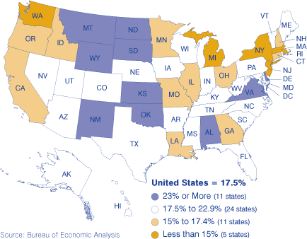
Any data series ending in 2005 is distorted by Hurricane Katrina. Louisiana and, to a lesser extent, Mississippi are seen at their worst. Their end-state for the period is substantially depressed. Even so, over the years 2000 to 2005, both of these states performed better in job growth (Louisiana 2.4 percent, 39th, and Mississippi 0.9 percent, 45th) than did Indiana (0.2 percent, 47th). In earnings per job, Indiana (19.0 percent, 26th) did exceed Louisiana (15.3 percent, 45th) but not Mississippi (21.0 percent, 19th).
A careful comparison of Figures 4 and 5 shows that only four states (Montana, New Mexico, Virginia and Wyoming) were top performers in both job growth and growth of earnings per job. Statistical analysis shows no meaningful correlation between the two data series. Job growth and earnings growth are not related to each other, either positively or negatively.
Figure 4: Job Growth Rates by State, 2000 to 2005
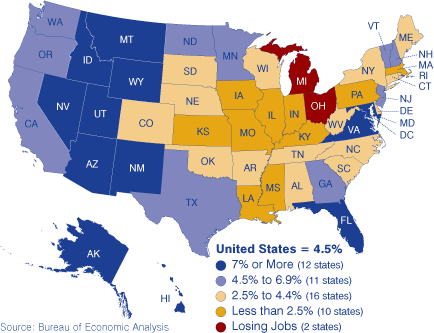
Figure 5: Growth Rates for Average Earnings per Job, 2000 to 2005
Indiana Counties
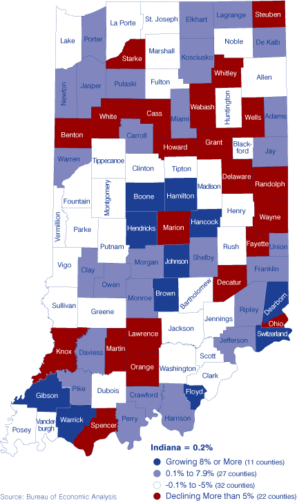
Hamilton County added the most jobs (36,500) between 2000 and 2005. Hamilton County (up 33 percent) ranked second behind Hancock County (up 44 percent) in rate of job growth. Marion County had the greatest job loss (38,900). This makes it appear that there is a lot of job churning in the Indianapolis metro area, but we don't know for sure. The largest loss on a percentage basis was ‑27 percent in White County. In all, 54 counties lost jobs over the period while 38 gained (see Figure 6).
Figure 6: Job Growth Rates in Indiana Counties, 2000 to 2005
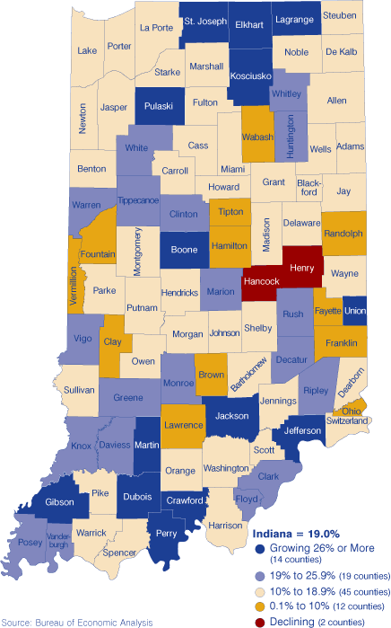
The best percent gain in earnings per job was in Gibson County (home of the first Indiana Toyota plant) with a 56 percent increase. Only two counties saw average earnings decline between 2000 and 2005. Yes, decline, even without adjustment for inflation. They were neighbors Hancock and Henry counties, along I-70 between Indianapolis and Richmond. Even though Hancock had the highest rate of job growth, these must have been low paying jobs because average wages fell by 7 percent. Henry may be the classic case of a loss in well-paying jobs followed by a decline in earnings per job because there are few alternative high paying positions available locally. Figure 7 offers a view of where earnings grew fastest and slowest.
Figure 7: Growth Rates for Average Earnings per Job in Indiana, 2000 to 2005
Does a rapid rate of job growth lead to faster growing earnings per job? The answer for the nation was no. It is the same for Indiana counties. In Figure 8, each dot indicates one of Indiana's 92 counties. Henry and Hancock are below the horizontal axis indicating they had declines in earnings per job. While White and Martin counties both had better than average (19.0 percent) growth in earnings per job, they were among the 54 counties that saw declines in the number of jobs.
Figure 8: Labor Market Changes for Indiana Counties, 2000 to 2005
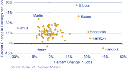
The clustering of most counties into a tight area is just a graphic representation of the absence of a relationship between job growth and advances in earnings. As can be seen most easily from the five counties identified on the right side of Figure 8, high rates of growth in jobs can be associated with a wide range of growth rates for earnings per job.
What do we want: High rates of job growth or high rates of growth in earnings per job? It would be best to have both, but if we must choose, what would be your community's answer? Do we make our cities and towns attractive to firms that employ large numbers of workers or to employers of highly paid people? What has been our state's answer over the past 20 years?
Morton J. Marcus, Director Emeritus
Indiana Business Research Center, Kelley School of Business, Indiana University