Indiana's On the Map: New Way to Access Labor Force Data
Indiana is now among the states whose data is accessible through OnTheMap version 2.2, a Web-based mapping application from the U.S. Census Bureau's Local Employment Dynamics program. OnTheMap is a powerful tool with many uses. Users can zoom in to get neighborhood data not available elsewhere or zoom out to regional labor markets that cross state boundaries.
This application, available at https://onthemap.ces.census.gov/, uses a standard Internet browser, but a high-speed connection is a must due to the large amount of data being processed. The data are useful (even if they seem a little old—2004 is the most current available), but because the interface is a little less than intuitive, some may overlook beneficial features. This article is somewhat of a mini-tutorial so you can get a jumpstart using this helpful tool.
Overlay Options
The first page of the website allows you to focus in on a basic geographic area. Once you're in the map interface, there are three ways to get data. Access these options by clicking the “Create/Change Overlay” button (see Figure 1).
Figure 1: Overlay Options
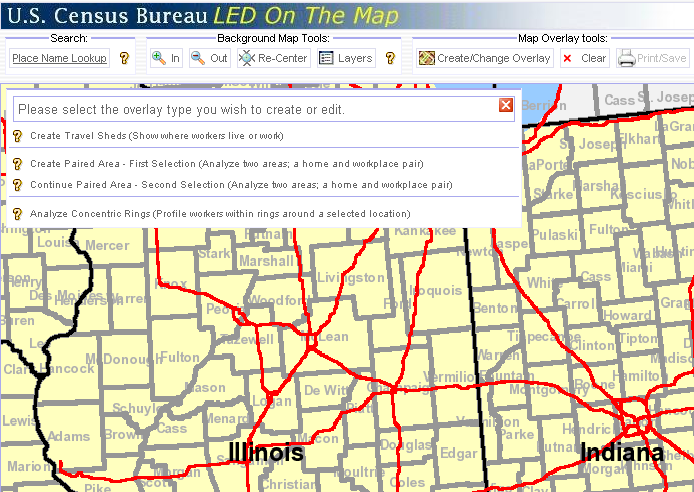
- Create Travel Sheds: Depending on if commute shed or labor shed is chosen, this profiles either residents who live in a selected location (e.g., where do people who live in Marion County work?) or workers employed within a selected location (e.g., where do people who work in the downtown Indianapolis 46204 ZIP Code live?).
- Create Paired Area: This option analyzes a single home and workplace pair (e.g., how many Lawrence county residents commute to the city of Bloomington?).
- Analyze Concentric Rings: Depending on if commute shed or labor shed is chosen, this creates profiles of residents or workers within three rings around a selected point using a user-defined radius (e.g., how do workers who live within two miles of the center of East Chicago differ from those who live within 5 miles or 10 miles?)
Selection Options
After you've selected an overlay, the next dialog box will ask you to define the selection area (among other things). Even though we're only going to look at layer selections in this article, the following four selection options are available, so users aren't necessarily limited to analyzing data for predefined geographies (see Figure 2).
Figure 2: Selection Options
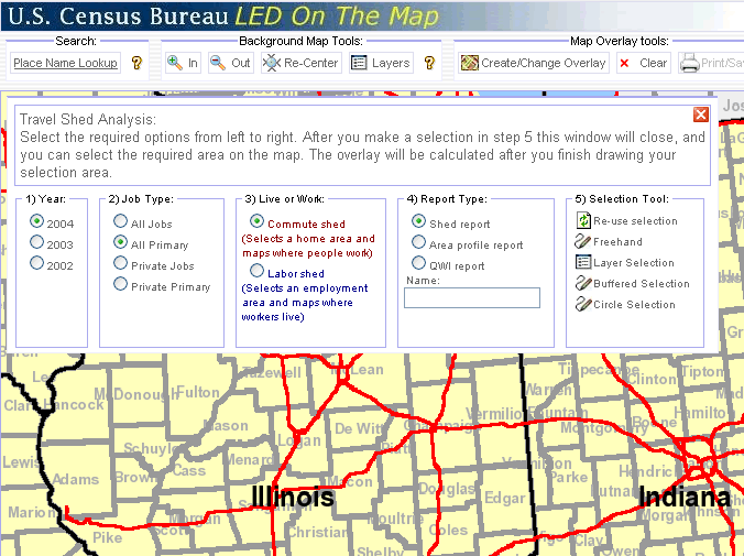
- Freehand Selection: Draw a freehand polygon on the map
- Layer Selection: Choose a layer type (such as counties, cities, townships or ZIP code tabulation areas) and then select a specific geographic unit on the map by dragging your mouse across it. *Tip: you need to drag your mouse across at least a portion of the geographic unit you want to select. Just clicking on it will not work.
- Buffered Selection: Builds a buffer around a line you draw on the map (you specify the radius for the buffer in miles).
- Circle Selection: Selects an area (using a radius you specify) around a point you select on the map
One of the improvements in this version of OnTheMap is that census blocks are used to define the selection area—excluding the freehand selection, which will continue to be defined at the block-group level.
Report Options
The same dialog box that asks you to define a selection area also wants you to specify a report type. The tables in this article provide the actual output from OnTheMap for various queries so you know what is available.
If you selected the travel shed overlay, you may choose between three different report options:
- Shed Report: If labor shed is selected, this report indicates where workers who are employed in the selected area live. As shown in Table 1, more than 60 percent of people who worked in the downtown Indianapolis ZIP code 46204 in 2002 lived in Marion County, but that number dropped to 55 percent by 2004. If commute shed is selected, the report indicates where residents who live in the selected area are employed.
- Area Profile Report: This report provides the characteristics of employed workers in the selected area. Figure 3 shows the map output for the Anderson and Fall Creek townships in Madison County. Table 2 provides the results of the associated area profile report, where we see that the percentage of residents employed in manufacturing dropped 2.5 percentage points between 2002 and 2004.
- QWI Report: This report provides 10 of the key quarterly workforce indicators. Table 3 shows these indicators for the census tract that will be home to the much-anticipated Honda plant in Greensburg.
Table 1: Labor Shed Report—Where Workers Employed in the 46204 ZIP Code Live
| Area Employment by Category | 2004:2 | 2003:2 | 2002:2 | |||
| Count | Share | Count | Share | Count | Share | |
| Total Employers: | 1,495 | 1,487 | 1,535 | |||
| All Jobs | 69,546 | 100.0% | 66,799 | 100.0% | 65,823 | 100.0% |
| All Jobs (Private Sector Only) | 50,690 | 72.9% | 49,453 | 74.0% | 49,315 | 74.9% |
| All Primary Jobs (Worker's highest paying job) | 65,519 | 94.2% | 62,662 | 93.8% | 62,191 | 94.5% |
| All Primary Jobs (Private Sector Only) | 46,835 | 67.3% | 45,621 | 68.3% | 45,949 | 69.8% |
| Baseline Count of Jobs | ||||||
| All Primary Jobs | 65,519 | 100.0% | 62,662 | 100.0% | 62,191 | 100.0% |
| Cities/Towns Where Workers Live* | ||||||
| Indianapolis city (balance) | 33,066 | 50.5% | 35,764 | 57.1% | 34,876 | 56.1% |
| Lawrence | 1,576 | 2.4% | 1,625 | 2.6% | 1,569 | 2.5% |
| Carmel | 1,473 | 2.2% | 1,428 | 2.3% | 1,288 | 2.1% |
| Fishers | 1,470 | 2.2% | 1,594 | 2.5% | 1,501 | 2.4% |
| Greenwood | 1,367 | 2.1% | 1,224 | 2.0% | 1,238 | 2.0% |
| Beech Grove | 624 | 1.0% | 615 | 1.0% | 642 | 1.0% |
| Fort Wayne | 541 | 0.8% | 427 | 0.7% | 366 | 0.6% |
| Speedway | 533 | 0.8% | 544 | 0.9% | 562 | 0.9% |
| Plainfield | 530 | 0.8% | 460 | 0.7% | 445 | 0.7% |
| Noblesville | 521 | 0.8% | 529 | 0.8% | 468 | 0.8% |
| All Other Locations | 23,818 | 36.4% | 18,452 | 29.4% | 19,236 | 29.4% |
| Counties Where Workers Live* | ||||||
| Marion | 36,289 | 55.4% | 39,064 | 62.3% | 38,128 | 61.3% |
| Hamilton | 4,637 | 7.1% | 4,678 | 7.5% | 4,443 | 7.1% |
| Johnson | 3,555 | 5.4% | 3,115 | 5.0% | 3,017 | 4.9% |
| Hendricks | 2,630 | 4.0% | 2,425 | 3.9% | 2,439 | 3.9% |
| Morgan | 1,236 | 1.9% | 1,044 | 1.7% | 1,131 | 1.8% |
| Hancock | 1,096 | 1.7% | 1,131 | 1.8% | 1,134 | 1.8% |
| Lake | 953 | 1.5% | 714 | 1.1% | 786 | 1.3% |
| Boone | 899 | 1.4% | 778 | 1.2% | 739 | 1.2% |
| Allen | 836 | 1.3% | 677 | 1.1% | 585 | 0.9% |
| Kosciusko | 733 | 1.1% | 683 | 1.1% | 673 | 1.1% |
| All Other Locations | 12,655 | 19.3% | 8,353 | 13.3% | 9,116 | 14.7% |
| States Where Workers Live | ||||||
| Indiana | 63,742 | 97.3% | 61,253 | 97.8% | 60,803 | 97.8% |
| Illinois | 321 | 0.5% | 260 | 0.4% | 262 | 0.4% |
| California | 286 | 0.4% | 159 | 0.3% | 151 | 0.2% |
| All Other Locations | 1,170 | 1.8% | 990 | 1.6% | 975 | 1.6% |
Source: U.S. Census Bureau, using LED Origin-Destination Database
Figure 3: Commute Shed: Where Residents of Anderson/Fall Creek Townships Are Employed
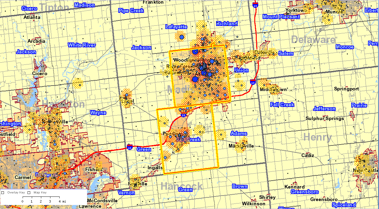
Table 2: Selection Area Profile—Characteristics of Resident Workers in Anderson and Fall Creek Townships (Madison County)
| Resident Held Jobs by Category | 2004:2 |
2003:2 |
2002:2 |
|||
| Count | Share | Count | Share | Count | Share | |
| All Jobs | 30,452 | 100.0% | 29,799 | 100.0% | 30,678 | 100.0% |
| All Jobs (Private Sector Only) | 26,265 | 86.3% | 25,604 | 85.9% | 26,636 | 86.8% |
| All Primary Jobs (Worker's highest paying job) | 28,496 | 93.6% | 27,856 | 93.5% | 28,724 | 93.6% |
| All Primary Jobs (Private Sector Only) | 24,546 | 80.6% | 23,919 | 80.3% | 24,874 | 81.1% |
| Baseline Count of Workers | ||||||
| All Primary Jobs | 28,496 | 100.0% | 27,856 | 100.0% | 28,724 | 100.0% |
| Workers by Age | ||||||
| Age 30 or younger | 8,283 | 29.1% | 8,116 | 29.1% | 8,462 | 29.5% |
| Age 31 to 54 | 12,568 | 44.1% | 12,525 | 45.0% | 13,093 | 45.6% |
| Age 55 or older | 7,645 | 26.8% | 7,215 | 25.9% | 7,169 | 25.0% |
| Workers by Earnings Paid | ||||||
| $1,200 per month or less | 7,216 | 25.3% | 7,244 | 26.0% | 7,415 | 25.8% |
| $1,201 to $3,400 per month | 17,009 | 59.7% | 16,461 | 59.1% | 17,080 | 59.5% |
| More then $3,400 per month | 4,271 | 15.0% | 4,151 | 14.9% | 4,229 | 14.7% |
| Workers by Industry Type (2-digit NAICS) | ||||||
| Agriculture, Forestry, Fishing and Hunting | 80 | 0.3% | 96 | 0.3% | 83 | 0.3% |
| Mining | 25 | 0.1% | 16 | 0.1% | 22 | 0.1% |
| Utilities | 41 | 0.1% | 32 | 0.1% | 25 | 0.1% |
| Construction | 1,373 | 4.8% | 1,230 | 4.4% | 1,234 | 4.3% |
| Manufacturing | 4,705 | 16.5% | 5,043 | 18.1% | 5,456 | 19.0% |
| Wholesale Trade | 1,179 | 4.1% | 1,114 | 4.0% | 1,166 | 4.1% |
| Retail Trade | 3,560 | 12.5% | 3,458 | 12.4% | 3,790 | 13.2% |
| Transportation and Warehousing | 947 | 3.3% | 920 | 3.3% | 896 | 3.1% |
| Information | 502 | 1.8% | 520 | 1.9% | 526 | 1.8% |
| Finance and Insurance | 1,268 | 4.4% | 1,281 | 4.6% | 1,221 | 4.3% |
| Real Estate, Rental and Leasing | 372 | 1.3% | 397 | 1.4% | 346 | 1.2% |
| Professional, Scientific and Technical Services | 906 | 3.2% | 835 | 3.0% | 959 | 3.3% |
| Management of Companies and Enterprises | 233 | 0.8% | 252 | 0.9% | 232 | 0.8% |
| Administrative, Support and Waste Management | 1,496 | 5.2% | 1,430 | 5.1% | 1,519 | 5.3% |
| Educational Services | 1,917 | 6.7% | 1,905 | 6.8% | 1,830 | 6.4% |
| Health Care and Social Assistance | 3,977 | 14.0% | 3,630 | 13.0% | 3,490 | 12.2% |
| Arts, Entertainment and Recreation | 372 | 1.3% | 383 | 1.4% | 370 | 1.3% |
| Accommodation and Food Services | 2,647 | 9.3% | 2,561 | 9.2% | 2,704 | 9.4% |
| Other Services (excluding Public Administration) | 811 | 2.8% | 706 | 2.5% | 832 | 2.9% |
| Public Administration | 2,085 | 7.3% | 2,047 | 7.3% | 2,023 | 7.0% |
Table 3: Quarterly Workforce Indicators (QWI) Profile—Census Tract 18031969200 (West of Greensburg)
| QWI Indicators—Private Sector Jobs | 2004:2 | 2003:2 | 2002:2 |
| Employment (Beginning-of-2nd quarter) | 3,694 | 3,600 | 3,560 |
| Employment, Stable Jobs | 3,370 | 3,260 | 3,224 |
| Separations, Stable Jobs | 202 | 225 | 218 |
| New Hires, Stable Jobs | 254 | 185 | 212 |
| Firm Job Gain | 181 | 118 | 89 |
| Firm Job Loss | 64 | 94 | 115 |
| Employment (reference quarter) | 4,357 | 4,150 | 4,046 |
| Average Monthly Earnings, Stable Jobs | $3,041 | $2,877 | $3,038 |
| Average Monthly Earnings Separations from Stable Jobs | $1,063 | $1,107 | $993 |
| Average Monthly Earnings, New Hires, Stable Jobs | $1,513 | $1,553 | $1,862 |
Source: U.S. Census Bureau, using LED Origin-Destination Database
If you selected either the paired area or concentric rings, the following reports are available:
- Paired Area Report: If labor shed is selected, this report provides the number of workers that are employed in selection area #1 and live in area #2, as shown in Table 4. If commute shed is selected, it provides information on workers that reside in selection area #1 and work in area #2.
- Concentric Circle Report: If labor shed is selected, this report provides information about people who work in each radius. If commute shed is selected, it provides employment information about those who reside in each radius, as shown for East Chicago in Table 5.
Table 4: Paired Area Report—Characteristics of Workers that Reside in Lawrence County and Commute to the City of Bloomington in Neighboring Monroe County
| Workers Residing in Lawrence County | 2004:2 |
|
| Count | Share | |
| All Jobs | 17,884 | 100% |
| All Jobs (Private Sector Only) | 14,853 | 100% |
| All Primary Jobs (Worker's highest paying job) | 16,834 | 100% |
| All Primary Jobs (Private Sector Only) | 14,012 | 100% |
| Residents of Lawrence County Working in the City of Bloomington | ||
| All Jobs | 2,330 | 13% |
| All Jobs (Private Sector Only) | 2,002 | 13.5% |
| All Primary Jobs (Worker's highest paying job) | 2,203 | 13.1% |
| All Primary Jobs (Private Sector Only) | 1,891 | 13.5% |
Source: U.S. Census Bureau, using LED Origin-Destination Database
Table 5: Concentric Ring Report—2004 Resident Workforce Profile for East Chicago (Commute Shed)
| Resident Held Jobs by Category | 10 Mi. Radius |
5 Mi. Radius |
2 Mi. Radius |
|||
Count |
Share |
Count |
Share |
Count |
Share |
|
| All Jobs | 247,500 | 100.0% | 75,900 | 100.0% | 13,745 | 100.0% |
| All Jobs (Private Sector Only) | 205,232 | 82.9% | 63,541 | 83.7% | 11,598 | 84.4% |
| All Primary Jobs (Worker's highest paying job) | 229,150 | 92.6% | 70,767 | 93.2% | 12,825 | 93.3% |
| All Primary Jobs (Private Sector Only) | 189,532 | 76.6% | 59,195 | 78.0% | 10,828 | 78.8% |
| Baseline Count of workers | ||||||
| All Primary Jobs | 229,150 | 100.0% | 70,767 | 100.0% | 12,825 | 100.0% |
| Workers by Age | ||||||
| Age 30 or younger | 62,672 | 27.3% | 20,785 | 29.4% | 4,610 | 35.9% |
| Age 31 to 54 | 119,693 | 52.2% | 35,098 | 49.6% | 5,728 | 44.7% |
| Age 55 or older | 46,785 | 20.4% | 14,884 | 21.0% | 2,487 | 19.4% |
| Workers by Earnings Paid | ||||||
| $1,200 per month or less | 60,773 | 26.5% | 18,392 | 26.0% | 3,798 | 29.6% |
| $1,201 to $3,400 per month | 113,103 | 49.4% | 35,654 | 50.4% | 7,071 | 55.1% |
| More then $3,400 per month | 55,274 | 24.1% | 16,721 | 23.6% | 1,956 | 15.3% |
| Workers by Industry Type (2-digit NAICS) | ||||||
| Agriculture, Forestry, Fishing and Hunting | 140 | 0.1% | 52 | 0.1% | 14 | 0.1% |
| Mining | 207 | 0.1% | 75 | 0.1% | 24 | 0.2% |
| Utilities | 1,381 | 0.6% | 530 | 0.7% | 75 | 0.6% |
| Construction | 8,694 | 3.8% | 3,155 | 4.5% | 472 | 3.7% |
| Manufacturing | 25,972 | 11.3% | 9,357 | 13.2% | 2,051 | 16.0% |
| Wholesale Trade | 8,419 | 3.7% | 2,912 | 4.1% | 522 | 4.1% |
| Retail Trade | 25,441 | 11.1% | 8,542 | 12.1% | 1,775 | 13.8% |
| Transportation and Warehousing | 12,453 | 5.4% | 3,195 | 4.5% | 404 | 3.2% |
| Information | 4,641 | 2.0% | 1,278 | 1.8% | 153 | 1.2% |
| Finance and Insurance | 10,985 | 4.8% | 3,084 | 4.4% | 286 | 2.2% |
| Real Estate and Rental and Leasing | 3,863 | 1.7% | 1,115 | 1.6% | 196 | 1.5% |
| Professional, Scientific and Technical Services | 8,355 | 3.6% | 2,391 | 3.4% | 283 | 2.2% |
| Management of Companies and Enterprises | 1,922 | 0.8% | 481 | 0.7% | 55 | 0.4% |
| Administrative, Support and Waste Management | 14,965 | 6.5% | 4,063 | 5.7% | 886 | 6.9% |
| Educational Services | 24,129 | 10.5% | 6,577 | 9.3% | 993 | 7.7% |
| Health Care and Social Assistance | 34,071 | 14.9% | 9,228 | 13.0% | 1,536 | 12.0% |
| Arts, Entertainment, and Recreation | 4,723 | 2.1% | 1,932 | 2.7% | 473 | 3.7% |
| Accommodation and Food Services | 16,513 | 7.2% | 5,298 | 7.5% | 1,202 | 9.4% |
| Other Services (excluding Public Administration) | 7,755 | 3.4% | 2,429 | 3.4% | 469 | 3.7% |
| Public Administration | 14,521 | 6.3% | 5,073 | 7.2% | 956 | 7.5% |
Source: U.S. Census Bureau, using LED Origin-Destination Database
Viewing the Results
After creating an overlay, all you will see on the map is the selection itself, which is a little unnerving because you think it didn't work. However, to see the distribution of the labor force or workforce, you can choose to display points, thermals or both underneath “Display Option.”
Point size is based on concentration of workers, while thermals show density using a workers per square mile calculation. The number of workers/jobs in each quarter-mile grid cell is averaged with the numbers from the eight adjacent cells and then converted to workers per square mile. The colors chosen for the thermal overlay make it a little difficult to see what is going on, so it is useful to use that layer in conjunction with the points layer by selecting the “Both” option. To see the actual legend breaks for a specific map, click the square next to “overlay key” in the legend in the lower left corner.
While the map gives a decent visual of commute and labor sheds, the real meat of this application is in the aforementioned reports, which will open up in a new window if you select the “Reports” option.
While a bit slow and a little clunky at first, OnTheMap may prove to be an indispensable resource for data you can't easily get anywhere else.
Rachel Justis, Managing Editor
Indiana Business Research Center, Kelley School of Business, Indiana University